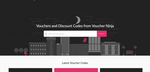
We have been working hard over the last month or so to bring a fresh, clean and re-branded version of our previous successful website, and we have to say it looks fantastic (if we do say so ourselves).
We launched the new look website a couple of weeks ago, and have been processing slight tweaks here and there throughout the last few weeks helping make your user experience as easy as possible. When we first started this project, we had a lot of big ideas from new features, to helping users find exactly what they are looking for.
Our solution…. Make the overall look and feel of the website clean, easy to use and navigate, and provide more useful information for you, the users of Voucher Ninja.
New Features
Reviews – We have now implemented store reviews onto the website, which you can easily submit your shopping experience for each store. These reviews are then reviewed by our team at Voucher Ninja before publishing.
More Information – We have more space to provide more information on each individual store, and out team are working hard to populate these new spaces with useful information.
Speed Improvements – We have built the new website with speed in mind, to make each page load as fast as possible.
New Pages – We have create a number of new pages, so you can easily find the most popular codes, codes that are expiring soon, and a list of all the new coupon codes we have submitted to the new look Voucher Ninja website.
We hope you love the new design and features we have implemented. Take a look at the new look Voucher Ninja website, and let us know what you think in the comments below.
